At a launch event for McQ in January 2006, the late designer described his diffusion label as “younger and more renegade, but always signature McQueen.” The line has held well to its first promise, though one could say its brand identity has been less developed — or made less distinct — than other designer diffusion labels like 10 Crosby Derek Lam, DKNY or the recently folded Marc by Marc Jacobs. (The fact that it was licensed to SINV SpA for its first five years certainly had something to do it with it.)
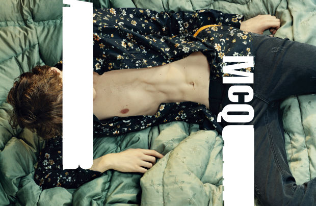
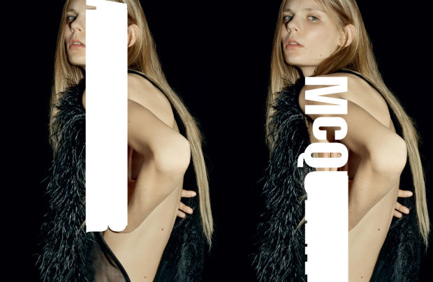
But all of that is changing. Since coming under the creative direction of Sarah Burton in November 2011, McQ has opened 16 standalone stores, and on Thursday, the Kering-owned company unveiled a new brand logo with the release of its fall/winter 2015 campaign. Gone is the romantic, curvilinear logo of yore; in its place is a bold, contemporary sans serif “Alexander McQueen” — but “Alexander” and the last four letters of “McQueen” have been whited out, redaction-style, so that only “McQ” is visible. Instead of being relegated to the corner of the ads, the new logo is splayed directly across the partially dressed bodies of models Elizabeth Ljadov and Tobias Lundh, sometimes covering their faces. It reads young, energetic and, to borrow McQueen’s earlier description, renegade.
Or, as the company puts it: “The new logo represents McQ’s irreverent attitude and rebellious spirit, redefining the relationship between McQ and Alexander McQueen.”
Via fashionista.com


